How to Use the Autumn 2019 Pantone Colors for Your Garden Rooms
02.09.2019
Hello, Instagram! This seems to have been on Pantone’s mind when they chose the Autumn-Winter colors for 2019. And, since we have just entered September, it’s time to take a look at how you can use those gorgeous shades to revamp your garden rooms and make them Instagrammable!
Energy. Confidence. Individuality. This is the message that the Pantone Color Institute is trying to send to us through the choice of colors for this autumn and winter. So this is exactly what we’ll be talking about. The meaning behind the shades, how you can use them for interior decorations of your garden rooms, and the colors themselves, of course. Let’s start with that!
The Autumn 2019 Pantone Colors
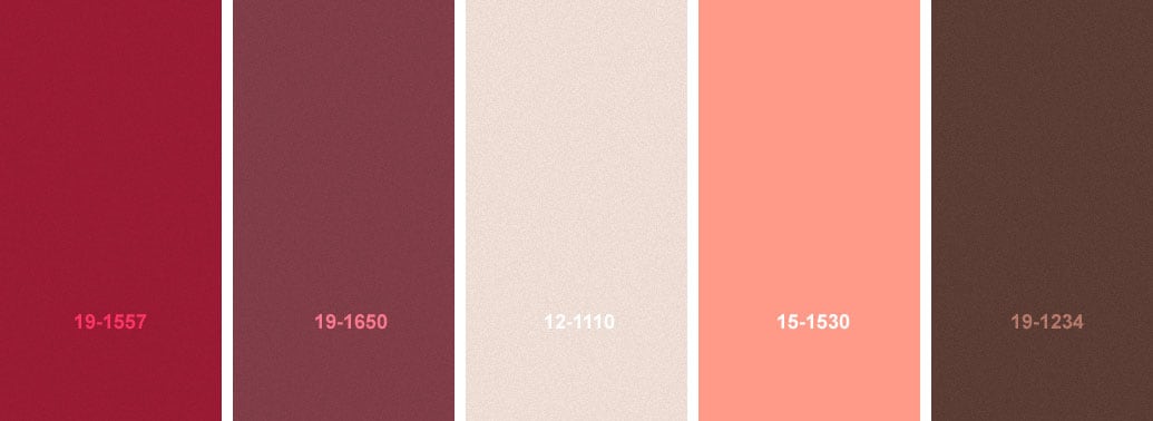
We know you’re ready to find out what they are so that you can start decorating, so let’s cut right to the chase. The colors Pantone has chosen for us this autumn are Chili Pepper and Biking Red as its number one and two. Crème de Peche is number three followed by Peach Pink, while the number five spot belongs to Rocky Road.
Let’s delve into some details about these amazing colors and how you can use them in your garden rooms. But before that, here’s a tip. You can also wear these colors because you will be seeing them absolutely everywhere this autumn so you might as well get with the trend!
#1. Chili Pepper – color number 19-1557
This is the number one color that will dominate the palette this autumn. If you feel like you’re already a little familiar with it, you’re not wrong. Chili Pepper is basically another shade of Fiesta, the color that Pantone proposed as number one for spring.
Therefore, if you have already redecorated in spring using Fiesta, all you need to do now is add a few Chili Pepper accents and you’re done! If not, and you want to make this new shade the star of the show, we suggest you use it wisely. Such a fiery color can be a lot to take for the eye.
#2. Biking Red – color number 19-1650
Here’s the difference between the two. Chili Pepper is warm and dramatic, meant to stimulate and excite you. Which is why we advised against using copious amounts of it while decorating your garden rooms. On the other hand, Biking Red is a richer, much deeper shade that has a cooler undertone. It is definitely a shade meant for autumn, according to specialists and designers.
#3. Crème de Pêche – color number 12-1110
The name of this color literally translate to ‘cream of peach’ from French. As its name suggests, it’s a light and creamy shade, almost ethereal. It’s pale and has a soft feminine quality to it that will add luminosity to your garden rooms and which both men and women can embrace.
The color is meant to be combined with Chili Pepper and Biking Red as it brings a little peace after all the drama they create. Therefore, if you are set to use the entire Pantone autumn palette in your garden rooms, think of adding some Crème de Peche curtains or even walls. They will give the eye a chance to rest.
#4. Peach Pink – color number 15-1530
We know what you’re thinking. Aren’t Crème de Peche and Peach Pink the same? No, they’re not. Peach Pink, is, in fact, much bolder than the former although they are sister colors. Think of a Cipriani bellini prosecco and you will understand how vibrant this bubbly peach pink is. As opposed to Crème de Peche which is soft and almost like a blush.
Evidently, the two will work beautifully together if, for example, you have decided to turn your garden rooms into a guest bedroom. Then you could use the two colors for the bedding and accent throw pillows.
#5. Rocky Road – color number 19-1234
If the Pantone Rocky Road shade does not put you in mind of rich chocolate ice cream, nothing ever will. Because this is exactly what it looks like. That might actually be where it got its name from – the eponymous ice cream flavor. Therefore, the shade is a very deep and cool toned brown that will mimic the earthy color you get to see as the weather changes from autumn to winter.
Pair it with Crème de Peche and Peach Pink at first, while the weather is still warm and summer still lingers in the September air. But when you get to October and November, you can start pairing it with Biking Red for a deep and rich autumnal palette. At the end of fall, mix and match Rocky Road with Chili Pepper to signal December is here and that you are ready to redecorate your garden rooms for Christmas!
What do the Pantone Autumn 2019 Colors Mean?
To put is simply, they mean energy, confidence, and individuality. Without a doubt, all these colors have been influenced by and chosen for people’s increased activity on Instagram. Not only that but you might have noticed for yourself that more and more public places such as bars, cafes, restaurants, and even museums are now redecorating to create photo-friendly interiors.
Pantone has catered to this new, modern life and has given everyone a set of colors that essentially look good in pictures. Apart from that, these shades are bold, vibrant, and theatrical. They can make you feel beautiful and confident, as well as energized. Mixing and matching these outstanding and dramatic colors can give you a sense of individuality that you can then share on social media.
What about you?
What do you think? Are you on board with this new trend? Do you love these color combinations and will you be using them in your garden rooms? Or are you more of a classic when it comes to interior design? Let us know in the comment section below!
Categories:
Blog
At Summer House 24 our guide on cleaning wooden sheds, both old and new, focuses on enhancing functionality, safety, and aesthetics. We walk you through comprehensive shed inspection, damage and condition assessments, tips on wood decay and structural integrity, general wear and tear check,s roof and foundation inspection, moisture and leak detection, and pest control methods…

Have you found yourself working from home more often as part of your weekly routine? If so, a garden room can be the perfect solution for your work-from-home needs! With more people working from home more frequently, the popularity of garden offices and outdoor rooms dedicated to work has risen significantly. With no sign of…

Are you considering turning your wooden summer house into the perfect home gym? Perhaps you already have a garden room you want to convert into a home gym, and you want some advice on what to do. Or maybe you are thinking about buying a wooden summer house to use as a home gym. Whatever…

It’s a debate that has gained significant traction in recent years. With more people working from home than ever before, the big question that is often asked is what the best home setup is for work life. In 2019, only 4.7% of us worked from home, but by January this year, 85% of people now…
Want to discuss over phone. Let us call back to you
If you need any additional info regarding any product, please fill in the below form and we will get back to you, usually the same or next working day.
Have any questions regarding some product?
If you need any additional info regarding any product, please send us your questions.